Real-Time Power BI Dashboards on Digital Signage: The Fastest Path from Data to Decisions
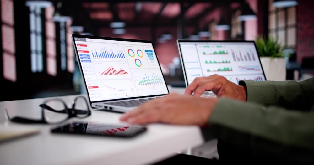
If you’ve invested in Power BI, you’re already halfway to a culture of data-driven decisions. But most insights die on the vine because they never leave a browser tab. Real-time dashboards on digital signage change that. They put the right metric in the right place—where frontline teams, supervisors, and leadership will actually see it and act.
Below is a practical, ROI-focused guide to deploying Power BI dashboards and reports on workplace screens—from shop floors and call centers to operations hubs and corporate corridors—complete with quantifiable benefits, example calculations, and implementation patterns that work.

Why Real-Time Dashboards on Screens Work
Most organizations rely on email digests, intranets, or ad-hoc reporting. Those channels have two big problems: they’re pull-based (employees must go find the data) and asynchronous (insights arrive after the window to act has closed). Digital signage flips the model to push and now:
- Ambient awareness: Metrics become part of the physical environment. People absorb context passively and continuously, not just in meetings.
- Shared truth: A single KPI digital display reduces “version wars” and aligns teams on what “good” looks like today.
- Faster micro-decisions: Supervisors and front-line staff can course-correct immediately—reroute labor, reset a process, fix a blockage—without waiting for a report run or a daily huddle.
This matters because data-driven decision making is strongly correlated with performance. Classic research by Brynjolfsson, Hitt, and Kim found firms that emphasize data-driven decision making see 5–6% higher output and productivity than peers—even after controlling for IT investments.
And you need those gains: Gallup reports only 31% of U.S. employees were engaged in 2024, a 10-year low. Screens that surface goals, progress, safety, and recognition help counter disengagement by making work visible and meaningful in the flow of work.
What to Put on Screens
1) Operations & Production
- Throughput vs. target, OEE, first-pass yield, scrap rate, downtime reasons
- Andon-style alerts when KPIs slip out of tolerance
- Hourly demand vs. staffing to rebalance labor
Visual management is a core lean practice for a reason: it surfaces abnormalities and enforces standards at a glance.
2) Sales & Service
- Pipeline health, bookings vs. quota, renewals, close rates
- Average handle time (AHT), first contact resolution, SLA adherence on contact-center digital signage
- Team leaderboards for friendly competition and recognition
Managers who track performance in real time can spot trend breaks between formal reviews and intervene sooner.
3) HSE/Quality & Compliance
- Safety KPIs (TRIR, near-misses), on-time audits, CAPA status, training completion
- Regulatory status dashboards and countdowns to key milestones
4) Corporate Communications & Culture
- Company scorecards, OKR progress, wins, customer kudos, milestones
- Rotating recognition panels (birthdays, certifications, awards)
A persistent communication rhythm matters because many employees report internal messages aren’t timely or accessible enough—creating misalignment that signage can help close.
Quantifiable Benefits You Can Expect
Think in three buckets: productivity, quality/risk, and engagement/retention.
1) Productivity Gains (5–6%+)
When teams can see live bottlenecks and rebalance in the moment, you capture the classic 5–6% productivity lift associated with data-driven decision making—often with no additional headcount or tooling. On a $20M operation, that’s $1.0–$1.2M annualized value.
2) Labor Cost Control (2–4% in many workforce environments)
Real-time staffing and demand dashboards help managers curb overtime, reduce overstaffing, and fix schedule mismatches before they burn cash. Even a 2–4% labor reduction in a $10M wage bill is $200–400k saved, with immediate visibility for union/non-union environments alike.
3) Throughput & SLA Adherence (1–3 pts of performance)
Live SLA tiles and “time-to-breach” countdowns on displays drive behaviors that protect revenue: on-time shipments, call-back promises, and service windows. Many teams see 1–3 percentage-point improvements just by elevating urgency—especially in dispatch, NOC, and contact-center settings. (Mechanism inferred from the signage and visual-management literature.)
4) Engagement Lifts = Fewer Errors And Lower Attrition
Engaged teams are consistently associated with higher productivity and better profitability; Gallup’s research links highly engaged units to materially stronger outcomes. In a tight labor market, even modest engagement improvements mean fewer hiring cycles and less knowledge drain.
Put differently: screens don’t motivate people; transparency does. Digital signage just makes transparency unavoidable.
ROI Math You Can Take To The CFO
Here’s a simple framework you can drop into a business case:
Annual ROI = (Productivity gains + Labor savings + Revenue protection + Attrition savings) – (CapEx + Licenses + Content ops)
Example (mid-size multi-site manufacturer, 25 screens):
- Productivity: $20M value-added × 3% realized of the 5–6% potential = $600k
- Labor: $12M wages × 2% overtime/overstaff reduction = $240k
- Revenue protection (SLA penalties, rush fees avoided): $100k
- Attrition savings (reduced backfill cost): 10 fewer exits × $7k backfill ≈ $70k
Gross benefit: $1,010,000
Costs (annualized):
- Screens & players (25 units): $2,000 each amortized 3 yrs ≈ $16,700
- CMS/licenses (signage + PBI Premium capacity or Pro seats as needed): $60,000
- Admin/content ops (0.3 FTE blended): $30,000
Total cost: $106,700 → Net ROI ≈ $903,300 (8.5× payback)
Your mileage will vary; this model is intentionally conservative and excludes quality/yield impacts, which can be large.
Real-World Signals
- Aviation HQ communications overhaul: Envoy Air (American Airlines Group) modernized its internal communications with centralized digital signage to deliver real-time updates—improving reach to a dispersed workforce that’s rarely at a desk and elevating recognition and culture touchpoints.
- Lean visual management in manufacturing keeps abnormalities obvious and speeds reaction time—an effect that signage-powered dashboards amplify across shifts and cells.
Implementation Patterns That Work (and why)
Pattern A: DirectQuery + Automatic Page Refresh for live KPIs
When sub-minute freshness matters (e.g., production, contact centers), use Power BI’s Automatic Page Refresh (APR) with DirectQuery-connected sources. APR instructs Power BI to query for new data at a defined cadence—great for “always-on” dashboards. Mind the refresh interval and data-source limits.
Pattern B: Import mode + scheduled refresh for hourly/daily cycles
For finance, HR, or compliance scorecards, half-hourly to daily refresh is usually enough. Import mode performs better for complex models; render those on signage with a cadence that matches decision cycles.
Pattern C: Secure embedding for internal portals
Use “Embed for your organization” (user-owns data) to place live reports in intranet pages or a signage-friendly web view without exposing data publicly. This honors Power BI permissions, RLS/OLS, and Microsoft Entra (Azure AD) auth—ideal for screens mounted in badge-restricted areas.
Avoid “Publish to web” for anything sensitive. That feature creates a public URL (no authentication) and is only appropriate for intentionally public data. Most organizations should keep it disabled by default per security best practices.
Pattern D: Embedded analytics (app-owns-data) for mixed audiences
If you’re building a custom hub for external stakeholders or contractors (no corporate Power BI licenses), Power BI Embedded (capacity SKUs A/EM/P) lets you generate embed tokens so viewers don’t sign into Power BI directly. This is useful for supplier portals or customer operations centers that also feed selected screens.
Design Principles For Screens That Change Behavior
1) One screen, one outcome. Decide what action the viewer should take if a tile turns red. If you can’t answer that, the metric doesn’t belong on the screen.
2) Ladder your horizons.
- Now: live exceptions, alerts, countdowns (SLA breach in 14m)
- Today: progress to target, bottlenecks (WIP aging, call backlog)
- This week: trends and leading indicators (yield drift, CSAT decay)
3) Use thresholds, not charts, for “at a glance.”
Big numerals with goal lines and color states (green/amber/red) trump dense visuals. Use small multiples (e.g., per-line throughput) over tabs.
4) Favor relative targets.
“92% to plan” is more actionable than raw “8,124 units.”
5) Include recognition.
Rotate a “wins” panel (orders shipped, safety days, customer kudos, birthdays). It nudges culture and boosts attention to the whole screen cycle—especially valuable in low-engagement environments.
6) Build for distance and dwell time.
Large fonts, 10–15 second loops for high-traffic zones; 30–60 seconds in dwell zones (cafeterias, team rooms). Avoid interactivity on digital displays—use QR codes when a deeper dive is needed.
Governance, Security, and Reliability
Keep data safe (and compliant)
- Authentication and access: For internal signage, stick with secure embed so viewers on screens see only what they’re already permitted to see. RLS and OLS carry through.
- “Publish to web”: Treat as public publishing only, disabled by default and tightly governed via tenant settings.
- Security posture: Microsoft’s security white paper covers DLP and governance patterns for regulated environments—use it to align with infosec early.
Make it reliable
- Data SLAs: Document freshness and fallbacks. If a source is down, rotate the playlist to a “maintenance” slide and prevent stale data from eroding trust.
- Heartbeat tiles: Add a small “data age” indicator (e.g., “updated 2m ago”) to each dashboard.
- Network & player resilience: Cache last-good frame and auto-reconnect; alert ops on player offline events.
Adoption playbook (90 days)
Weeks 1–2: Align on KPIs & screens
- Pick two workstreams (e.g., production line + customer service).
- Define “red-amber-green” thresholds with owners; map metrics to decisions.
Weeks 3–4: Build & pilot
- Create purpose-built Power BI views for signage (bigger DAX cards, minimal slicers).
- Choose APR + DirectQuery or Import + scheduled per use case.
- Secure-embed into your signage CMS; mount two pilot screens.
Weeks 5–8: Iterate
- Run daily standups at the screen; track micro-decisions and remove clutter.
- Add recognition panels; confirm data latency meets needs.
Weeks 9–12: Scale
- Expand to adjacent teams; formalize content owner playbook and RACI.
- Introduce a monthly “metric of the month” to keep the loop fresh.
- Baseline and publish before/after metrics (see next section).
Measuring ROI (and proving it fast)
Track changes in run-rate metrics for the pilots and attribute conservatively:
- Throughput / cycle time
- Measure average units per hour or average handle time before vs. after.
- Attribute only the improvement that persists for 4+ weeks.
- Measure average units per hour or average handle time before vs. after.
- Labor & overtime
- Compare overtime hours and schedule alignment vs. demand.
- Document interventions triggered by the displays (e.g., reassigning agents).
- Compare overtime hours and schedule alignment vs. demand.
- SLA adherence
- Track breach counts and penalty spend. Create a tile that counts “minutes to next breach.”
- Track breach counts and penalty spend. Create a tile that counts “minutes to next breach.”
- Safety / quality
- Near-miss reporting, first-pass yield, defect escape rate.
- Near-miss reporting, first-pass yield, defect escape rate.
- Engagement signals
- Pulse survey: “I know how my work is performing today.”
- Tie to Gallup-style leading indicators of productivity and profitability.
- Pulse survey: “I know how my work is performing today.”
Tooling Tips For Power BI on Signage
- Model for signage: Create “display” report pages with large card visuals, KPI indicators, and minimal interactivity.
- APR settings: Start conservatively (e.g., 1–5 minutes) and tune based on data source load and licensing limits.
- Secure embed: Use the “Embed” option for internal portals (respects RLS/OLS). For external viewers without Power BI accounts, evaluate Power BI Embedded capacity and token flow.
- Placement: Treat screens like safety signage—put them where actions happen: near lines, team pods, dispatch, and break areas.
- Playlists: Mix live dashboards (60–70% of cycle) with context (SOPs, shift notes, wins).
- Data hygiene: A “bad data” banner is better than silently wrong numbers. Protect trust at all costs.
Addressing Common Objections
“Won’t people game the metrics?”
That’s a governance issue, not a signage issue. Publish a small handful of balanced measures (quality and safety alongside throughput) and rotate the spotlight so no single metric dominates.
“Isn’t this sensitive?”
Yes—and that’s why you don’t use public links. Use secure embedding that enforces your existing Power BI permissions and row-level security. Screens belong in controlled areas with physical access limits.
“Is the data really ‘real-time’?”
Often it shouldn’t be sub-second. Most frontline decisions benefit from 1–5 minute freshness. APR + DirectQuery or frequent scheduled refreshes are typically enough, and easier on your sources.
The Internal-Comms Dividend
Even when dashboards aren’t strictly “operational,” the communication value of screens is significant. Many employees say internal comms lack cadence and accessibility. A well-run signage program restores rhythm—short, frequent, consistent updates that make strategy and goals feel present in daily work.

And you’ll need that: manager and employee engagement have dipped over the past two years, with Gallup and major outlets flagging a sustained slump. Turning performance into a visible, shared mission—supported by real-time metrics and frequent recognition—helps.
Bottom Line
Real-time Power BI on digital signage is one of the fastest, least disruptive ways to turn analytics into everyday action. It works because it changes where decisions happen—on the floor, at the desk, in the moment—and it aligns teams around a shared, visible truth.
If you’re starting from zero, pick one value stream, mount two screens, and ship a purpose-built dashboard with simple RAG thresholds. Time the loop for your space, add a recognition tile, and run standups at the screen for four weeks. You’ll know it’s working when debates shift from “what’s the number?” to “what are we going to do about it?”
And that shift—more than any single metric—is the real ROI.
Sources
- https://www.sciencedirect.com/science/article/pii/S2090447920301076
- https://www.brightgauge.com/blog/dashboards-as-an-assessment-tool
- https://www.axioshq.com/insights/internal-communications-statistics
- https://papers.ssrn.com/sol3/papers.cfm?abstract_id=1819486
- https://www.myshyft.com/blog/real-time-analytics-dashboards/
- https://www.brightgauge.com/blog/dashboards-as-an-assessment-tool
- https://icehrm.com/blog/essential-employee-engagement-stats-for-2023/
- https://www.avnetwork.com/news/video-case-study-how-envoy-air-elevated-employee-engagement
- https://www.sciencedirect.com/science/article/pii/S2090447920301076
- https://www.axioshq.com/insights/internal-communications-statistics
- https://www.gallup.com/workplace/654911/employee-engagement-sinks-year-low.aspx


